Office 315-A, 8th Floor,
Dawood Center, Auto Bahn Rd
Dawood Center, Auto Bahn Rd
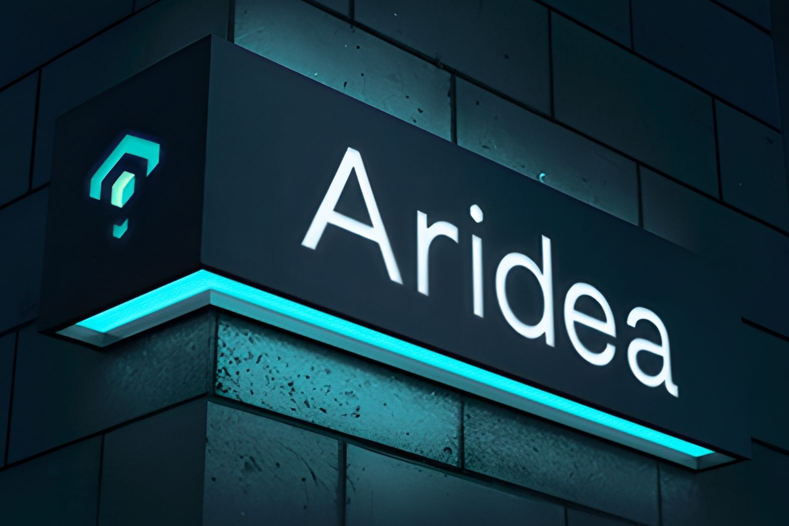
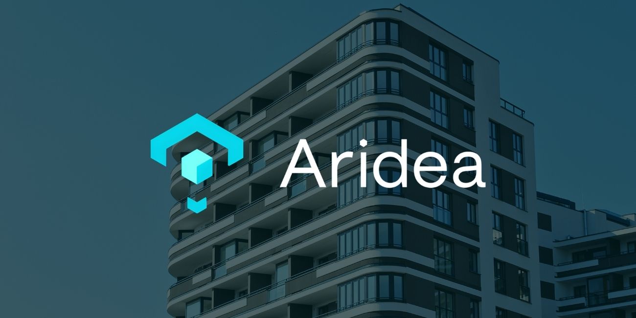
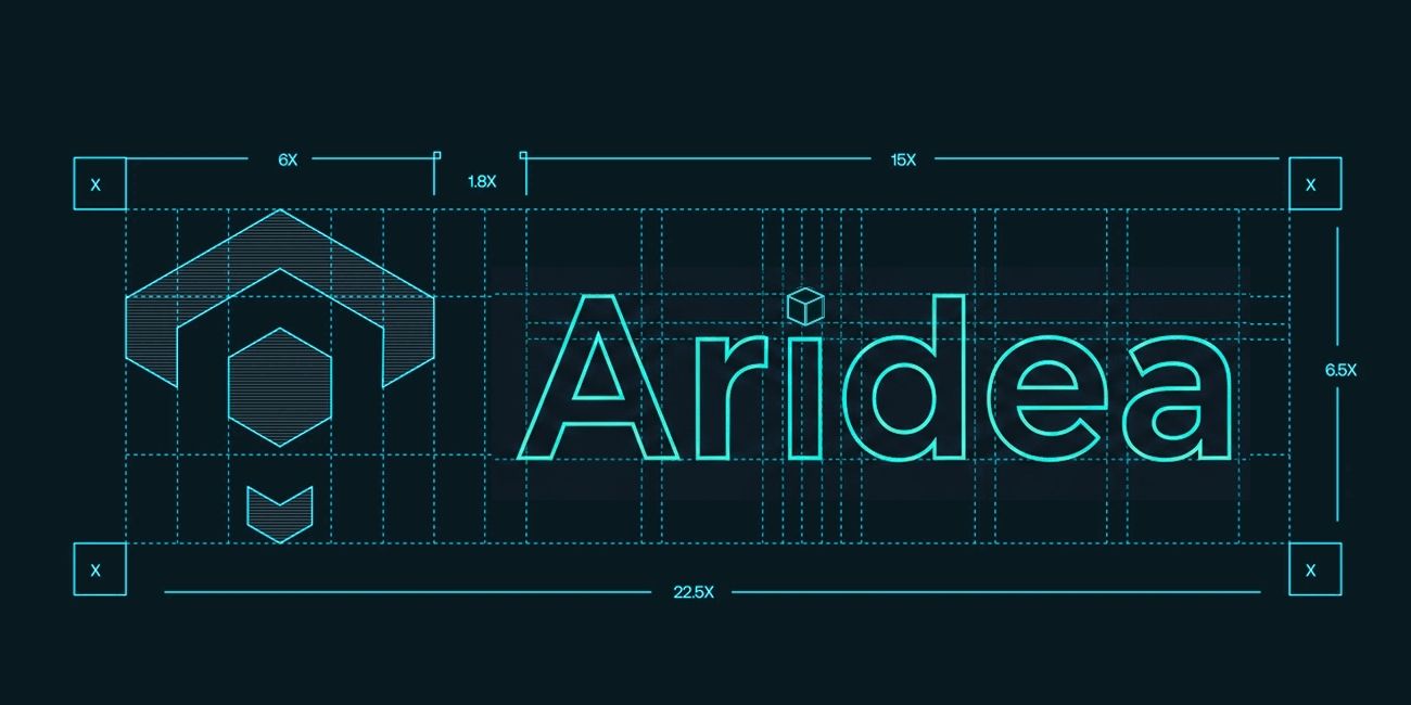
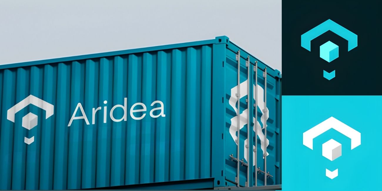
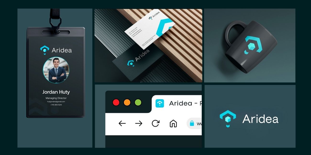
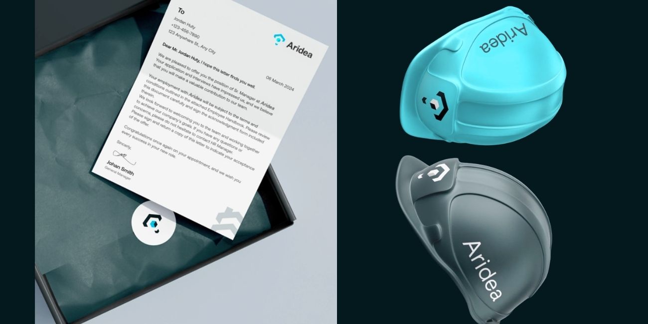
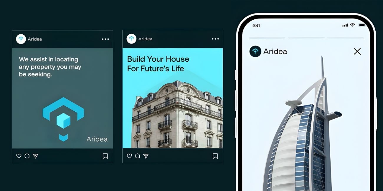
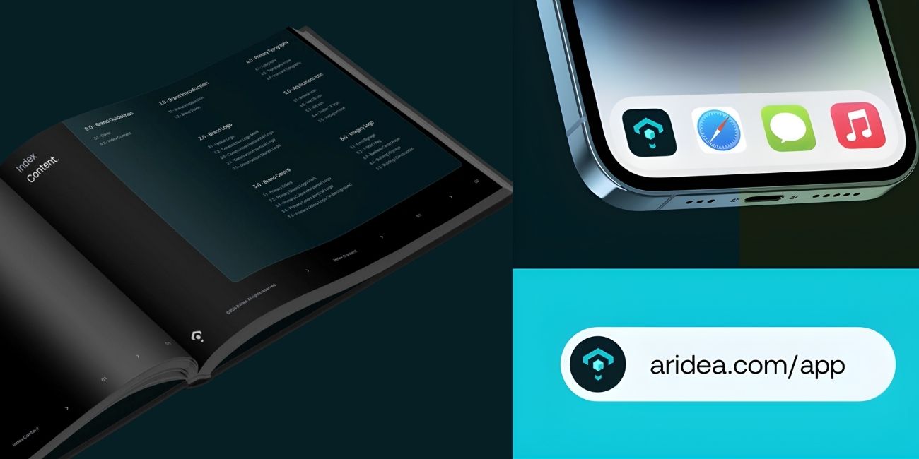
Egzecute developed a complete brand identity system to position Aridea as a contemporary architectural brand rooted in minimalism, precision, and emotional resonance.
Aridea had evolved beyond a traditional architecture practice, yet lacked a unified brand that reflected its philosophy of intentional design. The challenge was to articulate a clear brand narrative that balances art and functionality while differentiating Aridea from commercial competitors. We needed to translate architectural precision into a distinct, timeless identity that scales across environments.
Launch & Stabilization, full QA of print and digital assets, brand rollout supervision, and post-launch refinement.
Egzecute approached Aridea’s rebrand with a blend of strategic clarity and aesthetic restraint. We conducted in-depth workshops to uncover the brand’s architectural ethos and distilled it into a visual identity rooted in geometry, rhythm, and light. From naming refinement to visual storytelling, every asset was designed to evoke structure and serenity. Our process combined architectural logic with brand emotion, resulting in an identity system that feels built, not designed.
The new Aridea identity positions the brand as a leader in modern architectural expression , minimal, confident, and timeless. The brand now communicates its philosophy through every detail , from its logotype to printed collateral. Egzecute’s process delivered not just a design system, but a brand architecture built for longevity. Aridea stands as proof of how strategic branding can elevate perception, align teams, and shape a business that’s built to inspire.


Our goal is to nurture your vision and provide innovative, custom solutions for all your marketing needs.