Logo design is mostly editing.
Every logo we have ever delivered went through the same process: a wide ideation phase, then a much longer phase of removing things. The wide phase is the part juniors love. The removing phase is the part that decides whether the logo will survive its first year.
Most logo critique is framed as taste — "this curve feels off," "the proportions are wrong." But underneath those judgments is almost always a structural failure: the designer added one thing too many and could not let it go.
This is a short essay on the part of logo design no one teaches: editing.
The ideation trap
Design schools teach divergence first. Generate 50 concepts. Then 100. The thinking is that volume reveals quality. It often does — but only if the next phase is just as ruthless as the first.
What usually happens instead is that one of the 50 concepts gets chosen, and then the designer tries to make that concept work by adding. A subtle gradient. A second weight of the wordmark for "balance." A graphic mark to clarify the metaphor.
The added elements always look like they belong, because the designer who chose them is the same designer building the proportions around them. But the logo gets weaker with every addition. A logo's job is to be recognizable at a glance. Every extra element is a glance the viewer has to spend.
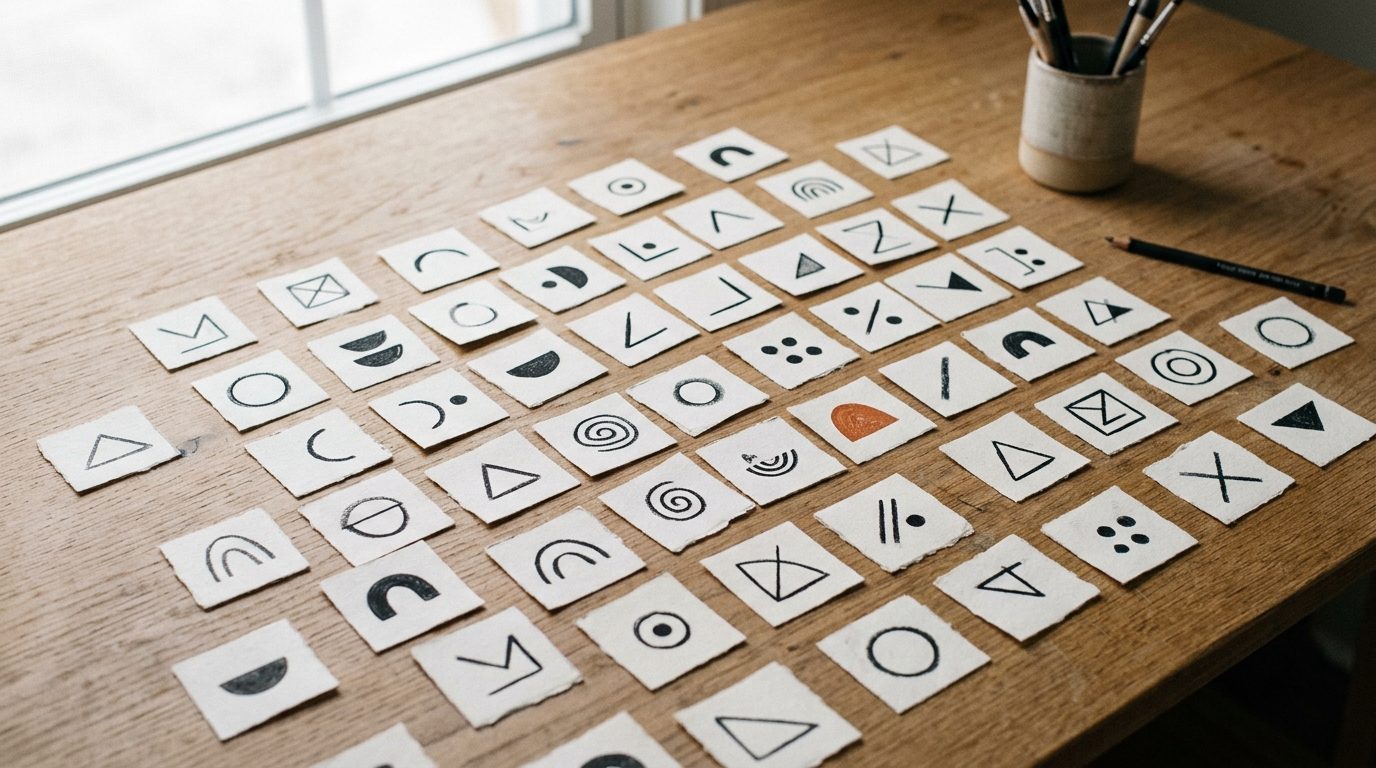
What we cut from every logo
When we audit our own in-progress work, we ask one question of every visual element: what is this doing that nothing else in the mark is doing? If the answer is "balance" or "feeling" or "completeness," we cut it.
The things we cut most often:
- Internal flourishes inside letterforms. A subtle notch, a curved tail, a stylized stem. They look clever at 800px and disappear at 32px.
- Secondary marks paired with the wordmark. A graphic mark next to a wordmark forces the viewer to do two reads. Pick one.
- Color gradients. Almost always a sign that the underlying form isn't strong enough to hold attention alone.
- Stylized punctuation. A custom period, a unique apostrophe. Looks bespoke. Reads as fussy.
- Decorative containers. A circle, a tag-shape, a frame. Frames are confessions that the mark inside cannot stand on its own.
This list isn't a rule book. There are great logos that do every one of these things. But the burden of proof is on inclusion, not exclusion.
A logo's job is to be recognizable at a glance. Every extra element is a glance the viewer has to spend. — Egzecute brand team
The "explain the cut" exercise
When a junior designer pushes back on removing an element, we use one exercise: explain in one sentence what the mark loses if this element is removed. If the sentence contains the word "feeling," "balance," or "presence," the element is decoration, not function, and it goes.
The exercises that pass this test are surprisingly narrow:
- "Without this, the wordmark and the symbol read as two separate things instead of one." (Functional — keep it.)
- "Without this, the mark is illegible below 24px." (Functional — keep it.)
- "Without this, the brand looks less premium." (Decoration — cut it.)
The first two cuts solve specific viewing problems. The third is a designer protecting their own taste from the discipline of the brief.
When to stop editing
Editing has its own failure mode: cutting until the mark is too spare to function as a brand. A pure geometric square is editable to the maximum. It is also not a logo, because it cannot belong to a single owner.
A logo is finished when removing one more element would damage recognition. Not aesthetics. Recognition. The test is: shrink the logo to 24×24, fade it to 50% opacity, and see if you'd still recognize the brand. If yes, you've found the floor.
Where that floor sits is different for every brand, and it is set by distinctiveness rather than by complexity. A mark built on an unusual letterform can survive being cut to almost nothing. A mark built on a common shape — a circle, a chevron, a generic swoosh — hits its floor early, because what's left belongs to everyone.
This is why the editing phase has to run after the ideation phase and not during it. You cannot tell which elements are load-bearing until you can see the whole structure.
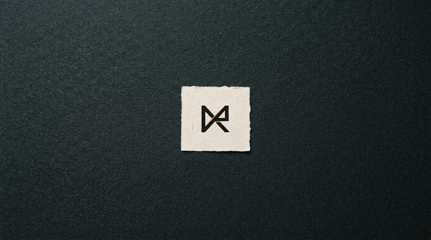
A short defense of the boring-looking logo
The logos that end up on this floor often look boring to designers. They have one idea. They use one weight. They occupy one shape.
That boredom is feature, not bug. The viewer is not looking at the logo to be entertained. They are looking at it to confirm "this is the brand I expect." Boring, in that frame, is a synonym for legible.
The brands that age best — Patagonia, FedEx, Apple under Rob Janoff, Pentagram's Saks — are all logos that survive the editing test. None of them look like they were added to over the years. They were cut into existence.
If you are working on a logo right now and it feels almost-but-not-quite-done, the answer is probably not another flourish. It is one more cut.